.jpg)
There has been a lot of online discussion recently about the actual colors of "The Dress." If you haven't heard about it already, in a nutshell, disagreements have ensued regarding whether the dress seen below is white and gold or black and blue. The question has taken on a life of it's own and become a hugely popular Internet meme. Numerous articles and blog posts have discussed everything from what the actual colors are to how your personality affects what colors you are seeing.
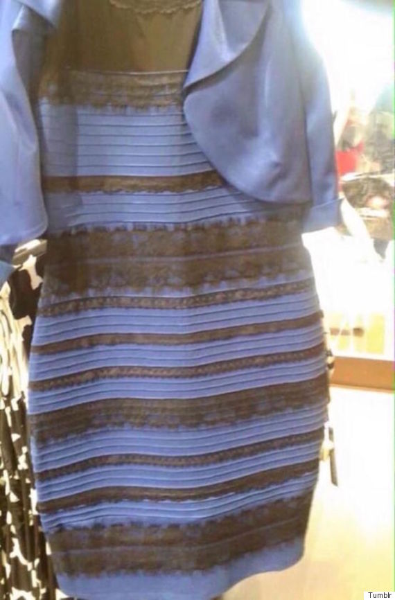
We aren't going to wade into what color the dress actually is, especially since that has appeared to have been answered. The Dress Color meme, however, has opened up an opportunity to discuss what is an ongoing issue for artists, galleries and museums: How color changes and is affected by different types of light sources. It's called metamerism and overcoming it is a challenge for photography and fine art printers alike.
How the color of the light (i.e. Kelvin temperature) reflects off the pigments in the ink affects how we see the color. For example, a black and white photograph hanging in a hotel lobby with fluorescent lighting might appear to have a green hue, while at home, under incandescent tungsten bulbs, the print will have a warm yellow cast. That same photograph displayed in a museum or gallery using industry standard Kelvin temperature lighting will appear to have no tint at all. That difference in color hue has to do with the varying Kelvin temperature of the light source.
Here at The Archives, we are dealing mostly with older film and negatives, many of which have lost their full gamut of color. If you were to have a digital camera raw file as opposed to a negative, the full range of color and detail from white to black is far greater then any printer can capture.
When we print for exhibitions, galleries and collectors, we have to manipulate all the individual colors independently via Photoshop, so as to control how the inks capture the pixel information and put it on media. All inks and media have color limitations. The challenge is how to overcome those limitations. When we create a print, we keep in mind the various light sources that the print could potentially be displayed under. At the Archives, we have various types of lighting, from standard fluorescent, to 47 and 5000 Kelvin solex bulbs that we view the print under to make sure the colors stay as consistent as possible under multiple types of lighting. Proof prints are even taken outside in order to see how it looks in natural sunlight.
To get the colors as close to perfect as we can often requires many proofs. It can be a detailed and meticulous process. The results, however, speak for themselves. When purchasing an Archives print, you can be assured that no matter what lighting it is seen under, observers won't be arguing about whether it is white and gold or blue and black.